[CSS] ベン図をCSSだけで描きたい
- 商品やサービスの特長をイメージ化したいときに、円を重ね合わせたベン図がよく使われます
- 今回は、3つの円を重ねたベン図と、2つの円を重ねたベン図、それぞれをCSSで描いてみました
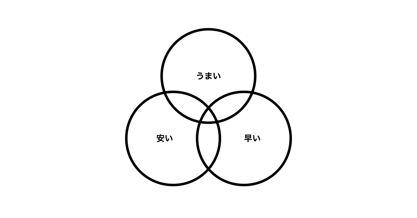
3つの円を重ねたベン図
html
<ul class="venn">
    <li>うまい</li>
    <li>安い</li>
    <li>早い</li>
</ul>
CSS
.venn {
    position: relative;
    padding: 0px;
    margin: 0px;
    width: 20em;
    height: 19em;
    font-size: 1.5vw;
    list-style: none;
}
.venn > li {
    display: flex;
    justify-content: center;
    align-items: center;
    position: absolute;
    width: 11.5em;
    height: 11.5em;
    box-sizing: border-box;
    border: solid 0.3em currentColor;
    border-radius: 50%;
    font-weight: bold;
    text-align: center;
}
.venn > li:nth-of-type(1) {
    top: 0px;
    left: 50%;
    transform: translateX(-50%);
    padding: 0px 0.5em;
}
.venn > li:nth-of-type(2) {
    bottom: 0px;
    left: 0px;
    padding: 0px 2.5em 0px 0.5em;
}
.venn > li:nth-of-type(3) {
    bottom: 0px;
    right: 0px;
    padding: 0px 0.5em 0px 2.5em;
}
- 幅と高さを設定したリストの中に、li要素を「position: absolute;」で座標指定して配置します
- 一つ目のli要素は上部中央に、二つ目のli要素は左下に、三つ目のli要素は右下になるよう指定します
- li要素に書かれた内容が円の線と被らないよう、「padding」で余白を設けています。余白は掲載する文字量に合わせて微調整すると見た目が整います
.venn > li {
    〜
    border: solid 0.3em currentColor;
    border-radius: 50%;
    〜
}
- li要素に「border-radius: 50%;」を指定することで、円形に形を変えることができます
- 円の線の太さは「border: solid 0.3em currentColor;」の内容を書き換えて適宜調整してください
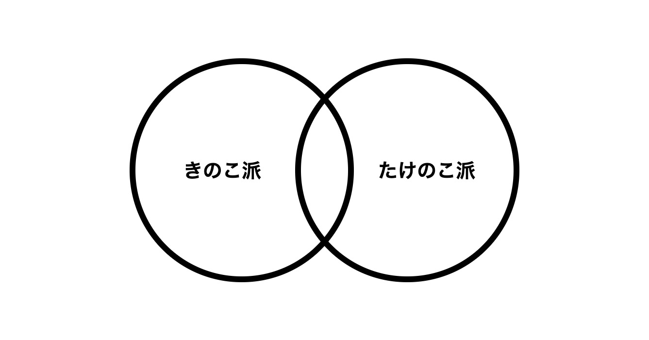
2つの円を重ねたベン図
html
<ul class="venn">
    <li>きのこ派</li>
    <li>たけのこ派</li>
</ul>
CSS
.venn {
    position: relative;
    padding: 0px;
    margin: 0px;
    width: 20em;
    height: 11.5em;
    font-size: 1.5vw;
    list-style: none;
}
.venn > li {
    display: flex;
    justify-content: center;
    align-items: center;
    position: absolute;
    width: 11.5em;
    height: 11.5em;
    box-sizing: border-box;
    border: solid 0.3em currentColor;
    border-radius: 50%;
    font-weight: bold;
    text-align: center;
}
.venn > li:nth-of-type(1) {
    top: 0px;
    left: 0px;
    padding: 0px 2.5em 0px 0.5em;
}
.venn > li:nth-of-type(2) {
    top: 0px;
    right: 0px;
    padding: 0px 0.5em 0px 2.5em;
}
ご質問など受け付けています
記事の中でわかりにくかったところ、もっと知りたかったこと、間違っていることなど、何でもお気軽にご連絡ください。
ご連絡は下記フォームを利用いただくか、ツイッターアカウント@flat8migi宛てでもOKです。