[CSS] ピラミッド型の階層図をCSSだけで描きたい
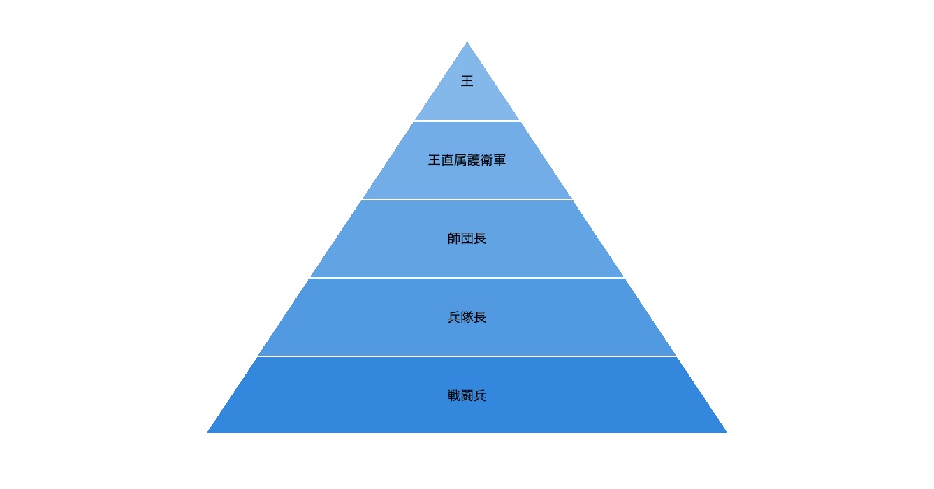
- 組織図や階層構造の表現によく利用される、ピラミッド型の階層図をCSSで描いてみました
- 図のサイズや色、ピラミッドの段数を変更する方法も合わせて補足しています。文章の中にちょっとした図解を入れたくなったときにご活用ください
サンプルコード
html
<ol class="pyramid">
    <li>王</li>
    <li>王直属護衛軍</li>
    <li>師団長</li>
    <li>兵隊長</li>
    <li>戦闘兵</li>
</ol>
CSS
.pyramid {
    position: relative;
    padding: 0px;
    margin: 0px auto;
    width: calc(8em * 5);
    list-style: none;
    font-size: 1.4vw;
}
.pyramid > li {
    display: flex;
    justify-content: center;
    align-items: center;
    height: 6em;
    box-sizing: border-box;
    text-align: center;
    white-space: nowrap;
}
.pyramid > li + li {
    border-top: 2px solid #fff;
}
.pyramid > li::before {
    position: absolute;
    top: 0px;
    left: 50%;
    width: 100%;
    transform: translateX(-50%);
    background-position: top -2px left 1px, top -2px right 1px;
    background-size: 50% calc(6em * 5);
    background-repeat: no-repeat;
    content: "";
}
.pyramid > li:nth-of-type(1)::before {
    z-index: -1;
    height: calc(6em * 1);
    background-image:
        linear-gradient(to bottom right, transparent 50%, #85b8ea 50%),
        linear-gradient(to bottom left, transparent 50%, #85b8ea 50%);
}
.pyramid > li:nth-of-type(2)::before {
    z-index: -2;
    height: calc(6em * 2);
    background-image:
        linear-gradient(to bottom right, transparent 50%, #73ade7 50%),
        linear-gradient(to bottom left, transparent 50%, #73ade7 50%);
}
.pyramid > li:nth-of-type(3)::before {
    z-index: -3;
    height: calc(6em * 3);
    background-image:
        linear-gradient(to bottom right, transparent 50%, #62a3e4 50%),
        linear-gradient(to bottom left, transparent 50%, #62a3e4 50%);
}
.pyramid > li:nth-of-type(4)::before {
    z-index: -4;
    height: calc(6em * 4);
    background-image:
        linear-gradient(to bottom right, transparent 50%, #5199e1 50%),
        linear-gradient(to bottom left, transparent 50%, #5199e1 50%);
}
.pyramid > li:nth-of-type(5)::before {
    z-index: -5;
    height: calc(6em * 5);
    background-image:
        linear-gradient(to bottom right, transparent 50%, #3388dd 50%),
        linear-gradient(to bottom left, transparent 50%, #3388dd 50%);
}
サンプルコードの解説
.pyramid > li::before {
    position: absolute;
    top: 0px;
    left: 50%;
    width: 100%;
    transform: translateX(-50%);
    background-position: top -2px left 1px, top -2px right 1px;
    background-size: 50% calc(6em * 5);
    background-repeat: no-repeat;
    content: "";
}
.pyramid > li:nth-of-type(1)::before {
    z-index: -1;
    height: calc(6em * 1);
    background-image:
        linear-gradient(to bottom right, transparent 50%, #85b8ea 50%),
        linear-gradient(to bottom left, transparent 50%, #85b8ea 50%);
}
- ピラミッド型の三角形は「linear-gradient」を使用してリスト要素全体の背景として描画しています
- 背景の色を各段で分けるために、各「li」タグの「before」要素にそれぞれ背景を設置しています
- 「li」タグ一つひとつに設定された、同じ大きさで色違いのピラミッドが5枚重なっているイメージです
- 各段の背景の表示範囲を「height」で制限し、「z-index」で重ね方を変えることで、あたかも一つのピラミッドであるかのように表示しています
サイズや色の変更方法
図のサイズを変えたい
.pyramid {
    〜
    font-size: 1.4vw;
    〜
}
- 「pyramid」クラスの「font-size」を変更してください
- ピラミッド全体のサイズや、各段の高さなどは「em」の単位で指定しているため、大本の「font-size」を変えることで連動して変化します
- サンプルコードでは、ウインドウサイズに連動する「vw」でサイズを指定していますが、ウインドウに連動してどんどん大きく(小さく)なってしまう点に注意してください
- メディアクエリを使って上限(下限)サイズを指定するなど、設置するページのレイアウトに合わせて調整してください
各段の色を変えたい
.pyramid > li:nth-of-type(1)::before {
    〜
    background-image:
        linear-gradient(to bottom right, transparent 50%, #85b8ea 50%),
        linear-gradient(to bottom left, transparent 50%, #85b8ea 50%);
}
- 各「li」タグの「before」要素に設定されている、2つの「linear-gradient」の色を変更してください
ピラミッドの段数を増やしたい
- リストに「li」タグを追加した上で、以下のようにCSSを変更してください
.pyramid {
    〜
    width: calc(8em * 5);
    〜
}
- 「pyramid」クラスの「width」に設定されている「calc(8em * 5)」を、段数に合わせて変えてください
- 段数を6段にする場合は「calc(8em * 6)」となります
.pyramid > li::before {
    〜
    background-size: 50% calc(6em * 5);
    〜
}
- 各「li」タグの「before」要素の「background-size」に設定されている「background-size: 50% calc(6em * 5);」を、段数に合わせて変えてください
- 段数を6段にする場合は「background-size: 50% calc(6em * 6);」となります
.pyramid > li:nth-of-type(6)::before {
    z-index: -6;
    height: calc(6em * 6);
    background-image:
        linear-gradient(to bottom right, transparent 50%, #3388dd 50%),
        linear-gradient(to bottom left, transparent 50%, #3388dd 50%);
}
- 新たに「li」タグの「before」要素を追加してください
- 上記は6段目を追加した場合のサンプルです
ピラミッドの向きを逆さにしたい
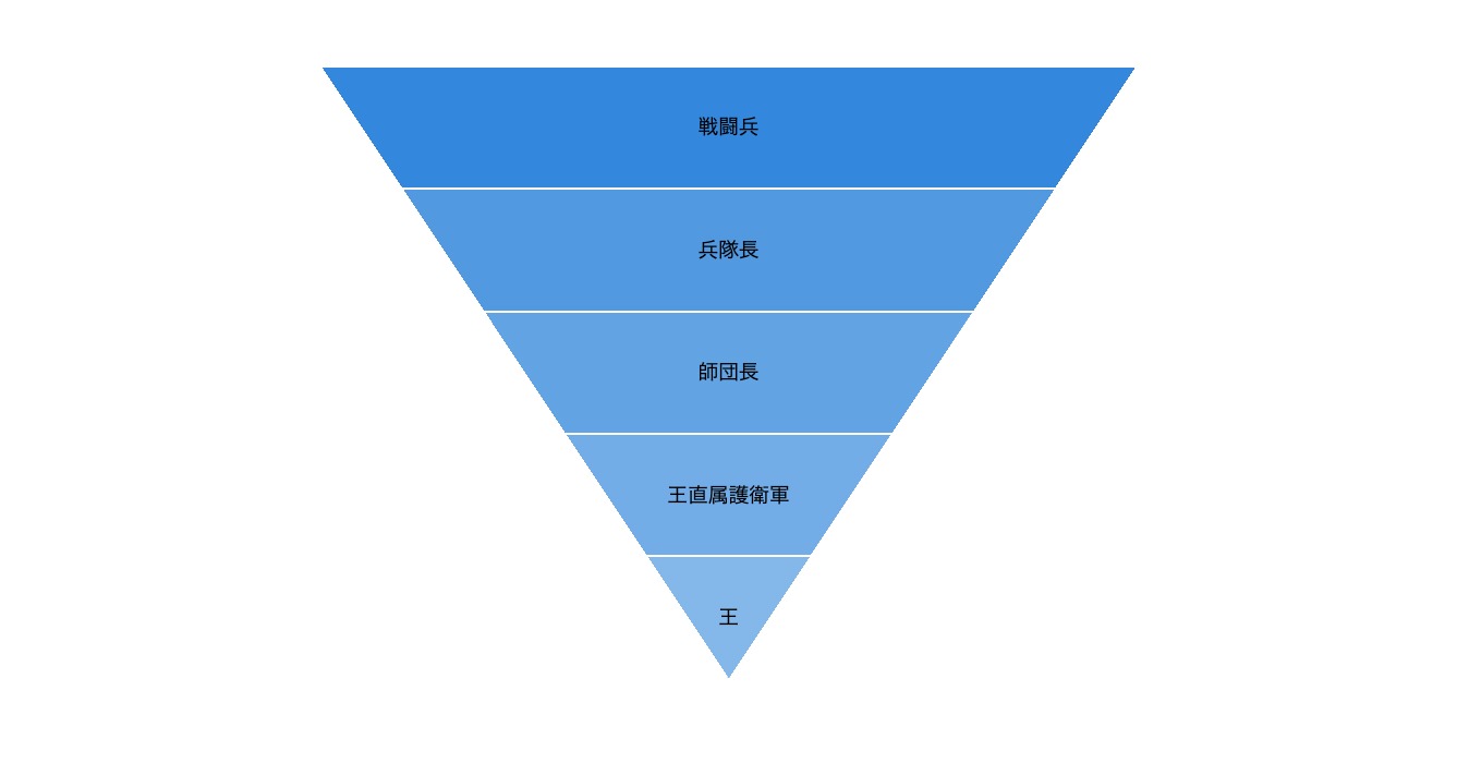
- ピラミッドをひっくり返して、逆三角形の漏斗形にしたい場合は、各「li」タグの「before」要素を以下のように変更します
.pyramid {
    position: relative;
    padding: 0px;
    margin: 0px auto;
    width: calc(8em * 5);
    list-style: none;
    font-size: 1.4vw;
}
.pyramid > li {
    display: flex;
    justify-content: center;
    align-items: center;
    height: 6em;
    box-sizing: border-box;
    text-align: center;
    white-space: nowrap;
}
.pyramid > li + li {
    border-top: 2px solid #fff;
}
.pyramid > li::before {
    position: absolute;
    top: 0px;
    left: 50%;
    width: 100%;
    transform: translateX(-50%);
    background-position: top 2px right 1px, top 2px left 1px;
    background-size: 50% calc(6em * 5);
    background-repeat: no-repeat;
    content: "";
}
.pyramid > li:nth-of-type(1)::before {
    z-index: -1;
    height: calc(6em * 1);
    background-image:
        linear-gradient(to bottom right, #3388dd 50%, transparent 50%),
        linear-gradient(to bottom left, #3388dd 50%, transparent 50%);
}
.pyramid > li:nth-of-type(2)::before {
    z-index: -2;
    height: calc(6em * 2);
    background-image:
        linear-gradient(to bottom right, #5199e1 50%, transparent 50%),
        linear-gradient(to bottom left, #5199e1 50%, transparent 50%);
}
.pyramid > li:nth-of-type(3)::before {
    z-index: -3;
    height: calc(6em * 3);
    background-image:
        linear-gradient(to bottom right, #62a3e4 50%, transparent 50%),
        linear-gradient(to bottom left, #62a3e4 50%, transparent 50%);
}
.pyramid > li:nth-of-type(4)::before {
    z-index: -4;
    height: calc(6em * 4);
    background-image:
        linear-gradient(to bottom right, #73ade7 50%, transparent 50%),
        linear-gradient(to bottom left, #73ade7 50%, transparent 50%);
}
.pyramid > li:nth-of-type(5)::before {
    z-index: -5;
    height: calc(6em * 5);
    background-image:
        linear-gradient(to bottom right, #85b8ea 50%, transparent 50%),
        linear-gradient(to bottom left, #85b8ea 50%, transparent 50%);
}
- 変更点を抜粋すると
.pyramid > li::before {
    〜
    background-position: top right, top left;
    〜
}
- 背景画像の開始位置を変更しています
.pyramid > li:nth-of-type(1)::before {
    〜
    background-image:
        linear-gradient(to bottom right, #3388dd 50%, transparent 50%),
        linear-gradient(to bottom left, #3388dd 50%, transparent 50%);
}
- 「linear-gradient」の塗り方を変えています。また、上の段から背景色が濃くなるように色も変更しています
小言:IE11の仕様?不具合?
- IE11では「linear-gradient」に「currentColor」を使うと色が表示されません
- IE11の対応を割り切れば、「currentColor」を使って以下のようにもう少しシンプルなコードにすることができます
.pyramid > li::before {
    position: absolute;
    top: 0px;
    left: 50%;
    width: 100%;
    transform: translateX(-50%);
    background:
        linear-gradient(to bottom right, transparent 50%, currentColor 50%) top 2px left 1px / 50% calc(6em * 5) no-repeat,
        linear-gradient(to bottom left, transparent 50%, currentColor 50%) top 2px right 1px / 50% calc(6em * 5) no-repeat;
    content: "";
}
.pyramid > li:nth-of-type(1)::before {
    z-index: -1;
    height: calc(6em * 1);
    color: #85b8ea;
}
.pyramid > li:nth-of-type(2)::before {
    z-index: -2;
    height: calc(6em * 2);
    color: #73ade7;
}
.pyramid > li:nth-of-type(3)::before {
    z-index: -3;
    height: calc(6em * 3);
    color: #62a3e4;
}
.pyramid > li:nth-of-type(4)::before {
    z-index: -4;
    height: calc(6em * 4);
    color: #5199e1;
}
.pyramid > li:nth-of-type(5)::before {
    z-index: -5;
    height: calc(6em * 5);
    color: #3388dd;
}
ご質問など受け付けています
記事の中でわかりにくかったところ、もっと知りたかったこと、間違っていることなど、何でもお気軽にご連絡ください。
ご連絡は下記フォームを利用いただくか、ツイッターアカウント@flat8migi宛てでもOKです。