[CSS] ポジショニングマップをCSSだけで描きたい
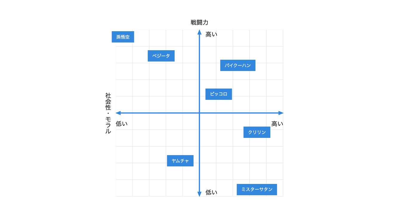
- サービスや企業、モノやコトの位置づけをわかりやすく図解したいとき、ポジショニングマップが役立ちます
- 縦軸と横軸で区切られた四つのエリアにモノゴトをマッピングしていくことで、それぞれの位置づけや、空いた手つかずの領域が明確になります
- 孫悟空のライバルと言えばベジータですが、「戦闘力」と「社会性・モラル」という二つの軸でポジショニングしてみると、一番好対照なのはミスターサタンだった、なんていう発見(≒こじつけ)が得られます
- 今回は、このポジショニングマップをCSSで描いてみました。コンテンツのわかりやすさを補強するツールとして活用してみてください
サンプルコード
html
<div class="pmap">
    <div class="pmap_vaxis">
        <span class="pmap_vaxis_title">戦闘力</span>
        <span class="pmap_vaxis_high">高い</span>
        <span class="pmap_vaxis_low">低い</span>
    </div>
    <div class="pmap_haxis">
        <span class="pmap_haxis_title">社会性・モラル</span>
        <span class="pmap_haxis_high">高い</span>
        <span class="pmap_haxis_low">低い</span>
    </div>
    <div class="pmap_item">
        <span>孫悟空</span>
        <span>ベジータ</span>
        <span>パイクーハン</span>
        <span>ピッコロ</span>
        <span>クリリン</span>
        <span>ヤムチャ</span>
        <span>ミスターサタン</span>
    </div>
</div>
CSS
.pmap {
    position: relative;
    margin: 0px auto;
    width: 32em;
    height: 32em;
    font-size: 1.5vw;
}
.pmap::before {
    position: absolute;
    top: 50%;
    left: 50%;
    z-index: -1;
    transform: translateX(-50%) translateY(-50%);
    width: calc(100% - 4em);
    height: calc(100% - 4em);
    background:
        linear-gradient(to right, #3388dd 0%, #3388dd 100%) center / 0.2em calc(100% - 1em) no-repeat,
        linear-gradient(to bottom, #3388dd 0%, #3388dd 100%) center / calc(100% - 1em) 0.2em no-repeat,
        linear-gradient(to bottom right, transparent 50%, #3388dd 50%) top -4px left calc(50% - 0.2em + 1px) / 0.4em 1em no-repeat,
        linear-gradient(to bottom left, transparent 50%, #3388dd 50%) top -4px left calc(50% + 0.2em - 1px) / 0.4em 1em no-repeat,
        linear-gradient(to top left, transparent 50%, #3388dd 50%) top calc(50% + 0.2em - 1px) right -4px / 1em 0.4em no-repeat,
        linear-gradient(to bottom left, transparent 50%, #3388dd 50%) top calc(50% - 0.2em + 1px) right -4px / 1em 0.4em no-repeat,
        linear-gradient(to top right, transparent 50%, #3388dd 50%) bottom -4px left calc(50% - 0.2em + 1px) / 0.4em 1em no-repeat,
        linear-gradient(to top left, transparent 50%, #3388dd 50%) bottom -4px left calc(50% + 0.2em - 1px) / 0.4em 1em no-repeat,
        linear-gradient(to bottom right, transparent 50%, #3388dd 50%) top calc(50% - 0.2em + 1px) left -4px / 1em 0.4em no-repeat,
        linear-gradient(to top right, transparent 50%, #3388dd 50%) top calc(50% + 0.2em - 1px) left -4px / 1em 0.4em no-repeat,
        linear-gradient(to right, transparent 99%, #ddd 1%) top left / 10% 10% repeat,
        linear-gradient(to bottom, transparent 99%, #ddd 1%) top left / 10% 10% repeat;
    content: "";
}
.pmap_vaxis_title {
    display: block;
    text-align: center;
}
.pmap_vaxis_high,
.pmap_vaxis_low {
    position: absolute;
    left: calc(50% + 1em);
    white-space: nowrap;
}
.pmap_vaxis_high {
    top: 2em;
}
.pmap_vaxis_low {
    bottom: 2em;
}
.pmap_haxis_title {
    position: absolute;
    top: 0px;
    left: 0px;
    width: 100%;
    height: 100%;
    text-align: center;
    writing-mode: vertical-lr;
    -ms-writing-mode: tb-lr;
}
.pmap_haxis_high,
.pmap_haxis_low {
    position: absolute;
    top: calc(50% + 1em);
    white-space: nowrap;
    writing-mode: initial;
}
.pmap_haxis_high {
    right: 2em;
}
.pmap_haxis_low {
    left: 2em;
}
.pmap_item > span {
    display: block;
    position: absolute;
    transform: translateX(-50%) translateY(-50%);
    padding: 0.5em 1em;
    background-color: #3388dd;;
    color: #fff;
    font-size: 0.75em;
    white-space: nowrap;
}
.pmap_item > span:nth-of-type(1) {
    top: 10%;
    left: 10%;
}
.pmap_item > span:nth-of-type(2) {
    top: 20%;
    left: 30%;
}
.pmap_item > span:nth-of-type(3) {
    top: 25%;
    left: 70%;
}
.pmap_item > span:nth-of-type(4) {
    top: 40%;
    left: 60%;
}
.pmap_item > span:nth-of-type(5) {
    top: 60%;
    left: 80%;
}
.pmap_item > span:nth-of-type(6) {
    top: 75%;
    left: 40%;
}
.pmap_item > span:nth-of-type(7) {
    top: 90%;
    left: 80%;
}
サンプルコードの解説
図のサイズ
.pmap {
    position: relative;
    margin: 0px auto;
    width: 32em;
    height: 32em;
    font-size: 1.5vw;
}
- 図のサイズを変更するときは「pmap」クラスの「font-size」を変更します
- 縦軸や横軸、各見出しの大きさなどを「em」の単位で指定しているため、大本の「font-size」を変えることで連動して変化します
- サンプルコードでは、ウインドウサイズに連動する「vw」でサイズを指定していますが、ウインドウに連動してどんどん大きく(小さく)なってしまう点に注意してください
- メディアクエリを使って上限(下限)サイズを指定するなど、設置するページのレイアウトに合わせて調整してください
縦軸・横軸の矢印とグリッドの描画
- 縦軸・横軸の線とグリッドは「linear-gradient」を使って背景画像として描画しています
- この2行の「linear-gradient」で縦軸と横軸の十字線を描画しています
linear-gradient(to right, #3388dd 0%, #3388dd 100%) center / 0.2em calc(100% - 1em) no-repeat,
linear-gradient(to bottom, #3388dd 0%, #3388dd 100%) center / calc(100% - 1em) 0.2em no-repeat,
- この2行の「linear-gradient」で縦軸についている上矢印の三角形を描画しています
linear-gradient(to bottom right, transparent 50%, #3388dd 50%) top -4px left calc(50% - 0.2em + 1px) / 0.4em 1em no-repeat,
linear-gradient(to bottom left, transparent 50%, #3388dd 50%) top -4px left calc(50% + 0.2em - 1px) / 0.4em 1em no-repeat,
- こちらは右矢印の三角形
linear-gradient(to top left, transparent 50%, #3388dd 50%) top calc(50% + 0.2em - 1px) right -4px / 1em 0.4em no-repeat,
linear-gradient(to bottom left, transparent 50%, #3388dd 50%) top calc(50% - 0.2em + 1px) right -4px / 1em 0.4em no-repeat,
- こちらは下矢印の三角形
linear-gradient(to top right, transparent 50%, #3388dd 50%) bottom -4px left calc(50% - 0.2em + 1px) / 0.4em 1em no-repeat,
linear-gradient(to top left, transparent 50%, #3388dd 50%) bottom -4px left calc(50% + 0.2em - 1px) / 0.4em 1em no-repeat,
- こちらは左矢印の三角形、となります
linear-gradient(to bottom right, transparent 50%, #3388dd 50%) top calc(50% - 0.2em + 1px) left -4px / 1em 0.4em no-repeat,
linear-gradient(to top right, transparent 50%, #3388dd 50%) top calc(50% + 0.2em - 1px) left -4px / 1em 0.4em no-repeat,
- この2行の「linear-gradient」で灰色のグリッド線を描画しています
linear-gradient(to right, transparent 99%, #ddd 1%) top left / 10% 10% repeat,
linear-gradient(to bottom, transparent 99%, #ddd 1%) top left / 10% 10% repeat;
- 「linear-gradient」で先に定義したものが上に描画され、後に定義したものは下に重なって描画されます
- グリッド線は一番下に描きたいため、最後に定義するようにしています
ご質問など受け付けています
記事の中でわかりにくかったところ、もっと知りたかったこと、間違っていることなど、何でもお気軽にご連絡ください。
ご連絡は下記フォームを利用いただくか、ツイッターアカウント@flat8migi宛てでもOKです。